
Mini Bathroom Makeover
Although providing you customized party goods is what Sequins & Lipstick is all about, I also love sharing glimpses into my personal life every now and again. Over the past few months, I’ve been taking you guys along the journey of my bathroom spruce up (not calling it a renovation because that’s much more involved) via Instagram and decided it’s time to document it all on the blog!
So, to get everyone up to speed, we live in a home that was built in the 1970s and, while it has some amazing features and charm, it also needs a lot of work (no house is perfect, right?). One of the biggest problem areas for me was our downstairs bathroom. It’s a full bath that’s right off the garage and close to Georgia’s playroom, which means I see it and use it all the time. This poor bathroom was an eyesore. Between the brown tile and #unfortunategranite, it was not fun to be in or look at, so I knew something had to change but didn’t want to break the bank to make that change. So, I did what any creative paper goods supplier in need of a bathroom upgrade does and started a pinterest board of bathroom ideas!

The Before
Almost right away, I realized two things at the same time. First, that replacing the granite and tile was going to be way too expensive. Second, that a fresh paint color can do wonders for any room in your house and is a much more affordable way to spruce up your space. I knew it was important that whatever color I chose complimented the #unfortunategranite while distracting from it and, because blue and grey are my safe zone colors, I decided it would definitely be in the blue or grey family.


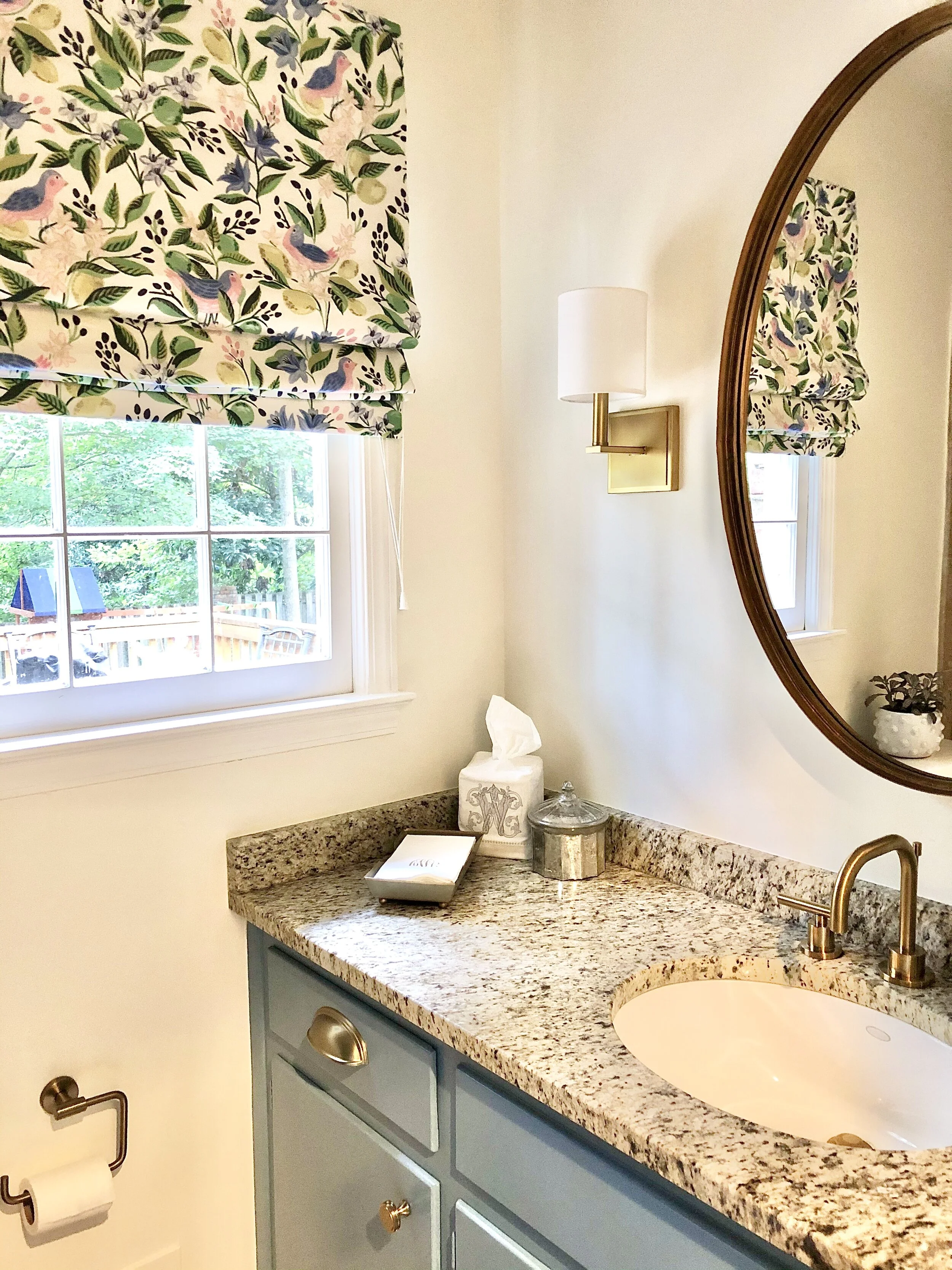
Hot tip: Buy paint samples before going all in on a paint color! This may seem like common sense to most, but it wasn’t to me. I was ready to buy a bucket of this blustery grey based on this pin alone, but decided I should maybe buy a few paint samples first. Thank goodness I did, because the grey I had lusted over turned out to be far too grey for me! The editing on that pin fooled me for sure. After a little deliberation, we went with the color “American Anthem” for the cabinet. As for the bathroom walls, I’ve been following Amy Havins’ blog forever, and she’s a devout White Dove enthusiast, so I felt this was the perfect opportunity to finally use it!
Truth be told, I originally wanted to wallpaper or shiplap the wall behind the mirror. A little fact about me: I’m an extremely impatient soul. So when I realized that the faux shiplap samples I ordered were going to take a few weeks to arrive, I changed my design strategy (read: My impatience got the better of me and I decided to settle on something else). Turns out my impatience paid off because the blank wall with just White Dove paint and two gold scones looks perfect! Not to say I’m ruling shiplap out my life, but I’m so glad we went the simple route for this bathroom.


Now onto the hardware. At first, I was committed to getting a round, gold mirror to mimic every bathroom I see on Instagram and Pinterest. But my impatience struck again at a lighting store when I couldn’t find a round mirror, but an oval one instead. I went with the oval and actually love it—it ended up making the white wall space feel bigger!
To stay on theme with the mirror, I wanted some gold hardware in my life, and this four knob plus two drawer pull situation seemed like a good (i.e. affordable) grouping to test out. I also swapped out the towel ring for this matching gold one! Quick laugh: At first, my husband was confused about this choice until I realized he was picturing shiny brass instead of gold. Shiny brass?! No thank you.
I quickly realized knobs and towel racks weren’t enough gold. The faucet clearly needed to be gold, too! During my search for the perfect gold faucet, I realized that, although gold fixtures have been a hot trend for a while now, gold faucets have not wavered in price. We went with this one, and I’m super happy with it—I just wish it was $100 cheaper (but, to be fair, I always wish everything was $100 cheaper).


With the paint colors on and the gold hardware in place, it was time to decide on a window treatment. I’ve had Cailin Wilson’s Citron Vert fabric flagged in a “I need this” folder for a while, I just wasn’t sure where to use it in my house. Turns out “American Anthem” is a pretty good match for the darker blue shade in her fabric, so I excitedly ordered a sample. My husband let me know immediately that it was atrocious, while also telling me he really didn’t care, so I took that as my green light to move forward*.


*TBH I would have moved forward anyway because, while he is a lovely man that I am so thankful to do life with, he rarely notices details like window treatments (or paint or fixtures or any minor detail not directly in his line of sight) unless I draw his attention to them. Truth be told, if he had been out of town the week I conquered this project, he might not have noticed the change when he got home!
So back to the fabric. Fabric is definitely an area in which you could really go all out in a project OR save some of your funds. It’s safe to say I went with the former because I ordered two yards of Cailin Wilson’s Citron Vert. Once it arrived, I took it to a local workroom and had an outside mount, roman shade made. I just love Roman shades and although I have no design background and don’t know whether or not Roman shades “go” in a space like this, I wanted it here. In that past, I’ve used a few online shops for window treatment projects, but this time I opted to try a local workroom and was happy with the results. For local Atlanta friends, I used Budget Upholstery on Winters Chapel Road. I don’t like to talk about money (totally agree with Sutton from RHOBH), but I am also an inquisitive person and like to know alllll the details when I’m reading a blog so I have no qualms sharing the cost of this window treatment with you guys. This one cost me $155 plus the cost of fabric, which is probably on the cheaper end for roman shades. From what I’m told, they’re labor intensive. Budget Upholstery charges $44 per vertical foot, plus a smidge for an upgrade to blackout lining, and you should always do the blackout lining! It really helps.
The After
All in all, I’m so happy with the outcome! It was more work (moving electrical) and more expensive (my cross to bear in life) than I planned, but I seriously love walking past this space and seeing the blue cabinet, gold scones, and happy fabric! I think the smaller, oval mirror helped tone down the reflection of brown shower tile, which is a huge plus. I’ve heard that large mirrors open up a space, but in this situation seeing more of the white wall makes the room feel larger and brighter. I also think the blue and gold make the #unfortunategranite choice look much more intentional. So while I would have never chosen these original bathroom materials, I think we found elegant ways to mask them and make the space a lot prettier!
It was so fun sharing this project with you all via instagram! Throughout the documentation of this spruce up, I heard from so many ladies who are also living the ugly tile and granite life. I hope this project gives you some inspo for some of your future projects, and always feel free to share your finished photos—I love a good before and after!
SHOP THIS POST


UPDATES
This project is still one of my favorites. The blue cabinet (American Anthem) is such a happy color!! No regrets here. Since wrapping up this project we added some beautiful artwork from Beth Colors. I asked her to use the Caitlin Wilson citron vert fabric as inspo and she did such a great job.
I also added this wood step stool for Georgia. It’s a bit taller than her previous step stool and she can reach the sink much easier now. And it’s a heck of a lot prettier than our previous step stool so I’m all for this type of toddler related update. Yay!